Coming up with a concept is always one of the biggest challenges in any project. At the core it’s what we as photographers can be known for. Anyone can click the shutter on an exposed photo; but to make it meaningful thats another thing. Concept creating for storytelling is one of the things I have been grateful to repeatedly hired on.
I was asked along with several of the biggest creative influencers in Sydney to create for several covers of the Sydney festival magazine. After researching Sydney festival in the lead up to the shoot, I had a few ideas in my mind. The major idea included the use of showing off the festival colours and how the art involved affected people.
The Brief - Use the colours blue, yellow, red in a meaningful way.
From there I thought about how I could make it out of the ordinary - I considered playing with a few constants like gravity and time. Finally I decided on the idea of inception, exploring the experience of the origin of art of the viewer. This involved having you as the viewer put yourself in the subjects shoes. What better a way to have them observe themselves?
The Technical:
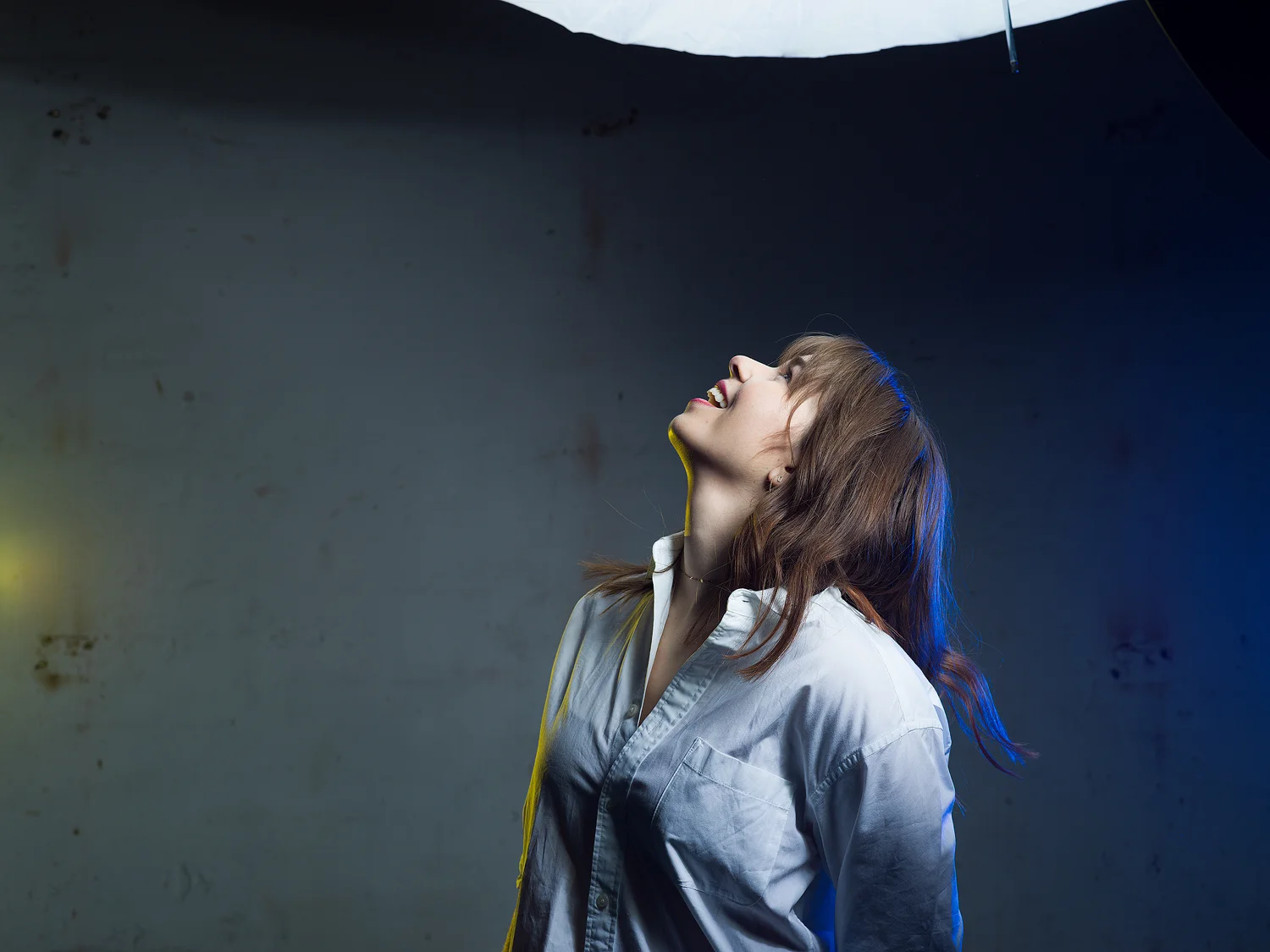
This is the first photo I knew had to get, the reaction between your mind and the viewing of the Art. It had to seem familiar and tie in so I kept the lighting very similar. The key Light had to come from above to look natural so the beauty dish gave a nice pop and provided some great contrast and strong lines on the face as the key. The fill light (or secondary light) was needed a little bit to bring up the shadows and the diffused umbrella overhead worked nicely to keep the beautiful unidirectional light effect strong.
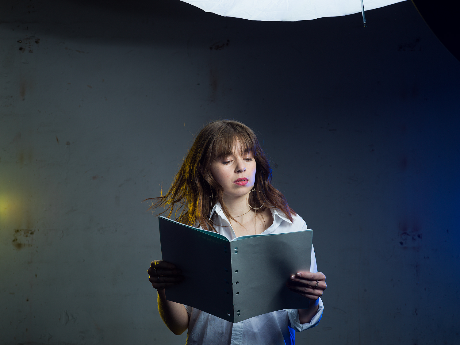
Next was a plate shot, so I could use any elements that got messy during the paint throwing. The lighting was the same and the gels used tied into the theme of the photoshoot by adding pops of colour of the yellow and blue which were nice complementary colours. The choice to not use red gels is because the red really stands out as the non complimentary colour and as you can see in the finished product the little touch of red is perfect for dragging you into the scene.
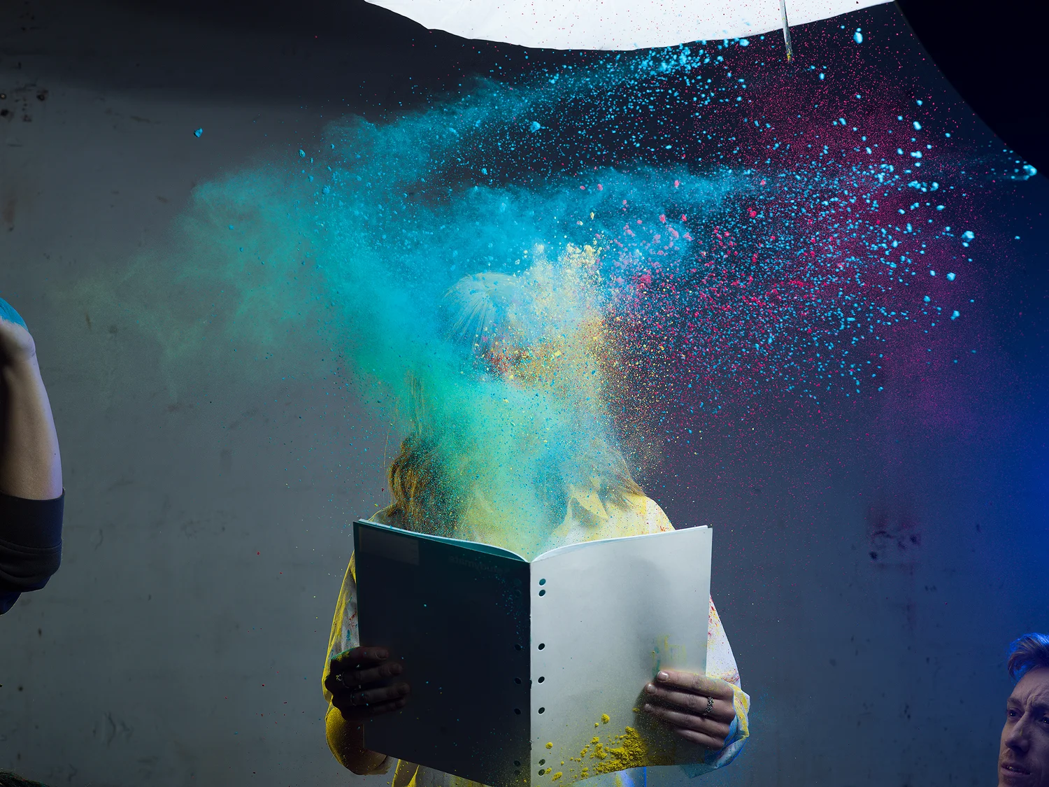
The Profoto D2's were perfect for the job because of the fast flash speed at high power. Freezing the paint in the air was crucial and it performed amazingly.
The Lighting diagram below is used with the beauty dish as the key light the umbrella as fill and the two gelled lights at the back tying the colour theme in using the white clothing as a bounce for the background and at the same time creating a rim light so even if the paint obscured the image you'd still get some depth to the body.
[Equipment: H6D100c Hasselblad with 100mm 2.2 lens; 4 D2 moonlights, a L diffused white umbrella, white gridded beauty dish and yellow and blue CTO gels.]

After colour correction and combination the final image.
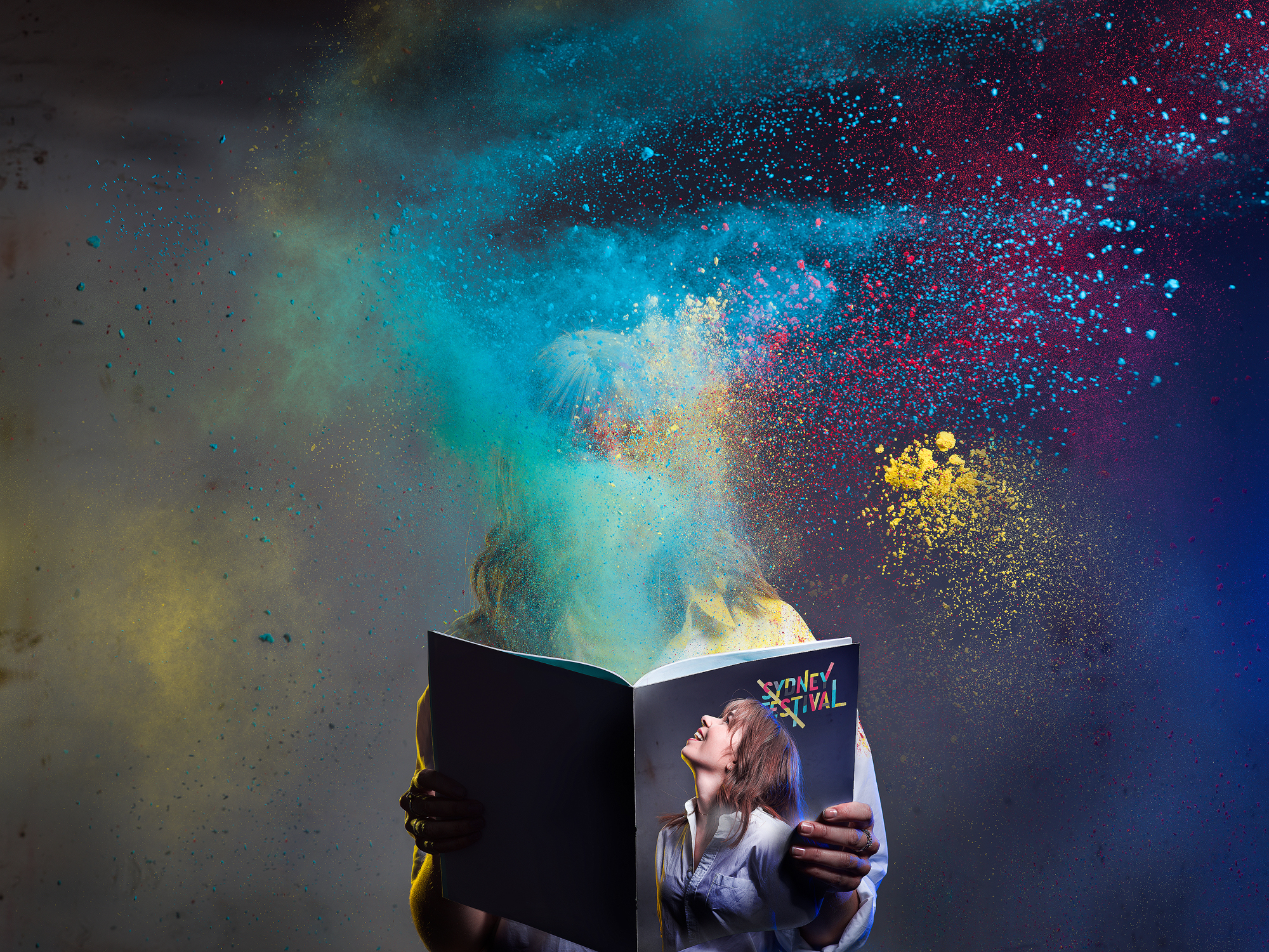
This was a simple shoot with nothing about it technically complex, 4 lights one model and $15 worth of props. However the story told makes the image take meaning, otherwise it’s just another crazy coloured studio image.
There is nothing more powerful than doing a little research and thinking about your image. Anyone can take a pretty photo, can you take one with meaning?
Thats something I certainly put highest on my list.
For more technical tutorials and blogs to help out achieve your beautiful visions, subscribe to my website www.davidboonphoto.com big plans to release a few free videos and tutorials soon.